
SEPHORA APP
UX/UI Improvement
IOS App | Individual Side Project

Time
2 weeks
2020.4
Scope
User interview, User journey,
Ideation, Wireframe,
Usability testing, prototyping,
UI design, Visual design
Tool
Sketch
Figma
BACKGROUND
I encountered some experience issues when I used Sephora App, so I came up the idea to conduct this design challenge. I interviewed 5 of my friends who uses Sephora App, read 50+ App reviews, identified and designed for 3 problems.
PROBLEM 1
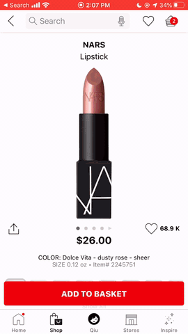
You have to click through the squares of color to find the name.
Inconvenient color selection interaction
This is the most complaints I found in App Store reviews, and 4 of my friends mentioned this issue.
Girls are not satisfied with the color selection process:
-
Can not directly choose the color by name. The color name appears only when click the color box. So the user have to click through the boxes to find a specific name.
-
Color name is hard to read. The text of color name is too small to read.
-
Color boxes and swatch images are not in the same screen. Users have to scroll down to the bottom to choose the color, then scroll up to see the swatch image.
RESEARCH
Girls’ journey map when pick a lipstick
To learn more about girls’ behavior pattern, feelings and needs when looking for a specific lipstick color,
I observed one of my friend’s process of selecting a lipstick, and record the process as the journey map.

Insights
Girls would like to find by
name directly when they
have a specific color in mind.
Girls tend to be attracted by color thumbnails and swatch images intuitively.
Girls like comparing back and forth among colors.
IDEATION
I ideated multiple solutions for each problem defined before, and analyzed each one's feasibility.
1. To find lipstick color by name

2. To make the color name more readable

3. To make the color thumbnails and swatch image in one screen

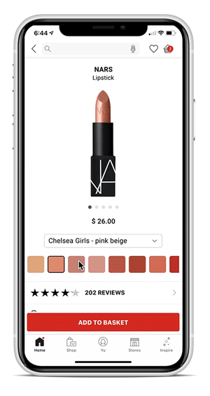
DECIDE
By combining feasible ideations, I came up with 2 versions of design solutions.
Then I used the sketched lo-fi, conducting usability testing, and record pros and cons from user feedback.

SOLUTION
The final solution was the combination of #1 and #2, providing easy accessible name list overlay, as well as keeping the intuitive color thumbnail bar. Also, I iterated the solution to provide easier color learning and comparison process.

FINAL DESIGN
PROBLEM 2
I wish that I could write notes to myself in the app.
Why do you want to write notes for yourself?
-- That would remind me the feeling when I used the product.
-- Write down why the product interests me.
-- Help me organize and pick products.
Girls’ real need -- Easier purchase decision making process.
The decision of buying a makeup product is not easy.
The note helps girls record their interests and feeling towards the product,
help them make the purchase decision more reasonable and effective.
APPROACH
I dived deeper about the purchasing user flow from collecting items to the final purchase,
categorized the user cases into 2 scenarios, and got 3 design approaches.
User case
-
Buy personal routine items.
-
Buy new longing items.
Design approach
-
Product detail page;
-
Purchase history;
-
Wish list.

SOLUTION
1. Leave notes on product page

2. Leave notes on Shopping List which combined History & Favorites

PROBLEM 3
The app is not cool.
Messy user interface
Sephora App is a fashion e-shopping platform, but the UI and visual style are not that fashion. There are many UI design problems.

RESEARCH
Competitive analysis:Nike App, Ulta App
Nike App shares the same color palettes -- black & white with the Sephora;
Ulta App is a similar makeup products e-purchase App.

REDESIGN
Redesigned the Shopping-Browse page and Track Order page.
Created better information organization, visual hierarchy, concise and fashion UI.
1. Shopping-Browse page

2. Track Order page

MEASUREMENT
User satisfaction grade
increase from 8 to 8.6
(out of 10, survey from my 5 friends)

REFLECTION
Practice critical thinking and problem solving in daily life
Once I was struggled to find original but practical design projects to do, but now I find there are bunch of opportunities to practice critical thinking and problem solving in my daily life. I, and my friends, are the real users of lots of products, and we encounter many problems everyday. These products are real industry projects, and we reflects the first-hand user feedback and needs.
As a Designer, I can practice the full design process from defining problem, understanding user, research, ideation, to final design, prototyping and usability testing. Though the design may not come true, but the process of dealing and designing a real problem, and getting good feedback makes me feel accomplished.